create website
How a website should look like? Website Research [Case study]
Thursday, April 28, 2016For this research, we`ve analysed more than twenty websites providing specific services or products. The results are based on tens of user-testing videos or written questionnaires to show you the elements that delight the consumers and those things that do not produce reactions or produce adverse reactions. Not only design but think about Digital marketing too.
Certainly, the results give you support for how you can set up a framework for getting your web site on track and get the most of your UI / UX design and content. It's also about digital marketing.
What is the optimal content? How big or how small? But the arrangement on the page, how to be to attract? You could talk about your business for days, without you having to stop. But think about it: visitors are attracted in the first seconds of something. If they find that information quickly, will remain on your site and chances are higher to react positively (to buy, to register, to ask you something, leave comments and any other action with impact). Putting together an SEO plan is the strategy you need for internet marketing.
Knowledge of your business stands out clearly. The home page of your website is the entrance door for new clients. Potential customers can reach your website via several approaches: directly (from a business card), from the search results of a search engine, from web directories listings, from sharing on social media, from mentions on other sites and blogs. Read on if you are interested to see the Digital marketing in action.
In our research, we`ve seen sites with a lot of products or services, and even with only one product/service, but very well described. We also viewed sites that attracted us in the first with something, and others that were causing crashes. Opinions of users tester were the same. The idea is to not give up ever asking your visitors, even if they have bought something or not. Regardless of their opinion, you should react.
Elements of a great home page that converts depend on your target audience. See what they like to do, how they behave naturally, why they`re acting in a certain way, where is produced the reaction in routine behaviour.
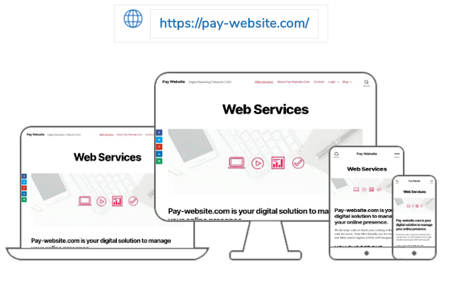
Case study - Highly-rated example: Pay Website
Pay-Website.com’s home page is one of only a few which we`ve analysed that didn’t place a too revealed navigation bar at the top of its homepage. It's pretty, located at the top of the page, where the search button exists.
1. The first positive impression was the welcome message, simple and yet complex in interpretation. This is the idea: in just a few words (as few as possible) to say what you mean actually and attract visitors. The image of the big city in the background is consistent with the message delivered. That means a job well done.
2. We believe that this website would target small and medium companies, freelancers or people with independent professional activities that can be found easier in a large community via their own website/app created by Pay Website`s team.
3. Information on the site is such that causes to ask for more details if you are interested in their services. Actually let you impose your own requirements, depending on the specifics of your business. You'd be tempted to ask for more information about a website created / re-designed for you?
Remember, "no one is perfect", and the same is applicable to the online world. Users have different requirements: which is fine for some, it might have gaps for others. Everything depends on the target audience you are referring to. You probably already know that a website made just for there to be, is not enough. Too little information or too much cause visitors to increase the bounce rate.
Updates
Soon we will show you sites that neglects many aspects that should delight visitors. But we will refer to with blurred images. We do not want to talk negatively about a business. We just want to pay attention to what does not cause emotions and what visitors actually expect to find on a website. For now, implement the positive things you read here, visit the site mentioned, and (why not) send us your opinion.


